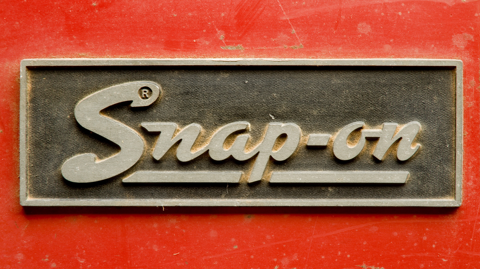
The iconic logo of Snap-on, a leading tool manufacturer, has undergone several transformations over its extensive history, reflecting the company’s growth and innovation since its founding. Established in 1920, Snap-on quickly became synonymous with quality and reliability in the automotive industry, known for its commitment to producing tools that provide exceptional performance.
The journey began with a simple yet revolutionary idea: five hand tools capable of performing the work of fifty through interchangeable socket attachments. This ingenuity laid the foundation for Snap-on’s reputation, which has endured for more than a century.
From Script to Bold Designs
The original logo, featuring a simple underlined script in red, remained in use from 1920 until 1944. This design was one of the longest-serving logos for the brand, symbolizing durability and quality. As the world transitioned into the 1940s, the logo began to appear outdated, prompting a redesign.
In 1944, Snap-on introduced a new logo that showcased the brand name in an italic script, positioned against a red background. This change coincided with the company’s significant contributions to the war effort, where the adoption of nickel alloy steel improved the tools’ durability to meet military standards. However, this iteration was short-lived, lasting only until 1948, when another redesign was introduced.
The logo from 1948 to 1953 featured a bolder font, aiming to capture attention in advertisements. It maintained the red background with white lettering, reflecting the design trends of the 1950s. The subsequent revision in 1953 reversed the colors back to red text against a white background. Notably, this was the only time the word “tools” was included in the logo, transforming it to “Snap-on Tools.” This branding served until 1981, demonstrating the lasting quality of Snap-on’s products, many of which remain functional today.
Modernization and Current Branding
In 1981, Snap-on simplified its logo, moving away from the “tools” designation and adopting a design that closely resembles the contemporary logo. This iteration introduced a playful feature: a wrench-shaped cutout in the letter “S,” a hallmark still present in the current design.
The colors were reversed again in 1995, leading to the final iteration of the logo, which features blockier text while retaining the core elements established over a century ago. This evolution encapsulates Snap-on’s commitment to innovation and quality, a commitment that resonates with mechanics and DIY enthusiasts alike.
Today, Snap-on’s logo stands as a testament to a heritage of excellence in tool manufacturing, continuously evolving while remaining rooted in its foundational principles. The brand not only reflects advancements in technology and design but also signifies a legacy of reliability that has made it a favorite among professionals and hobbyists in the automotive field.
